A lot of the interface elements in Cassette Nest are grouped into the category of what I call a “card” in the code. That includes things like cameras on the homepage, lists of projects, rolls of film on the inventory page, and other things. You can read more about the code behind them if you’re so inclined.
When I went to make some screenshots for the marketing site the other day, I noticed that some of the little “reminder tabs” on the homepage looked odd.
I ended up revamping the whole system, both CSS and HTML. The offending bit of interface now looks
like this.
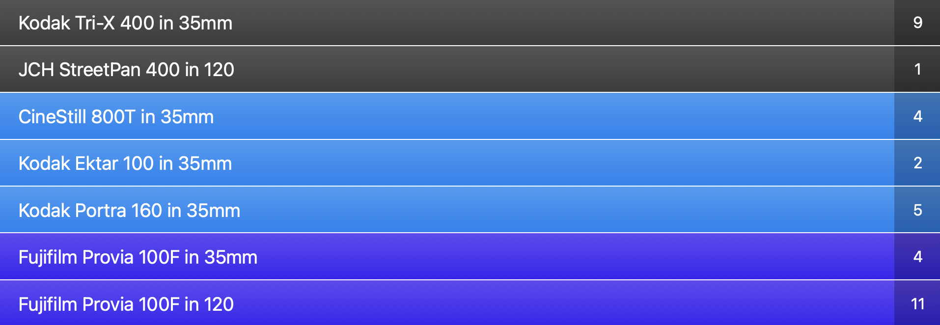
Here’s an example of all the available types before:

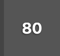
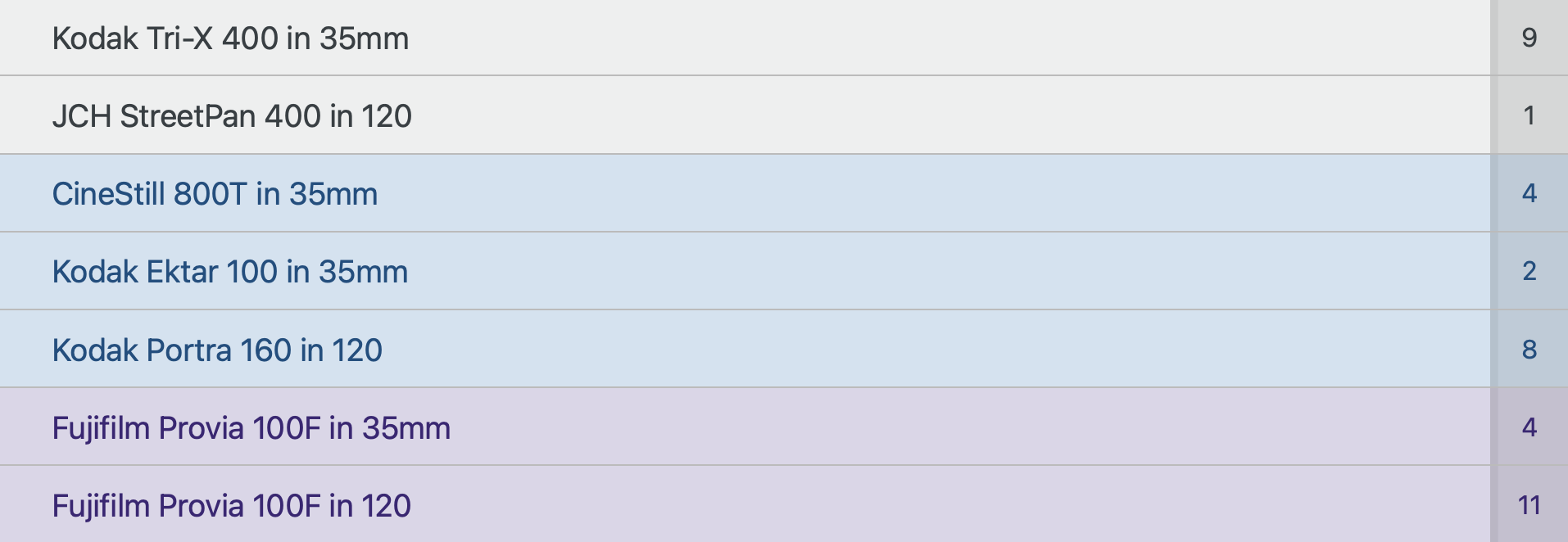
Here’s an example of all the available types now:
These new colo(u)rs were borrowed from the GOV.UK Design System, specifically from their tag component. This is yet another way Adam Silver has inspired how I build the interface for Cassette Nest. Pretty much all my form elements are based on the No Style Design System.
Here’s how film cards used to look.
Here’s how they look now.
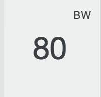
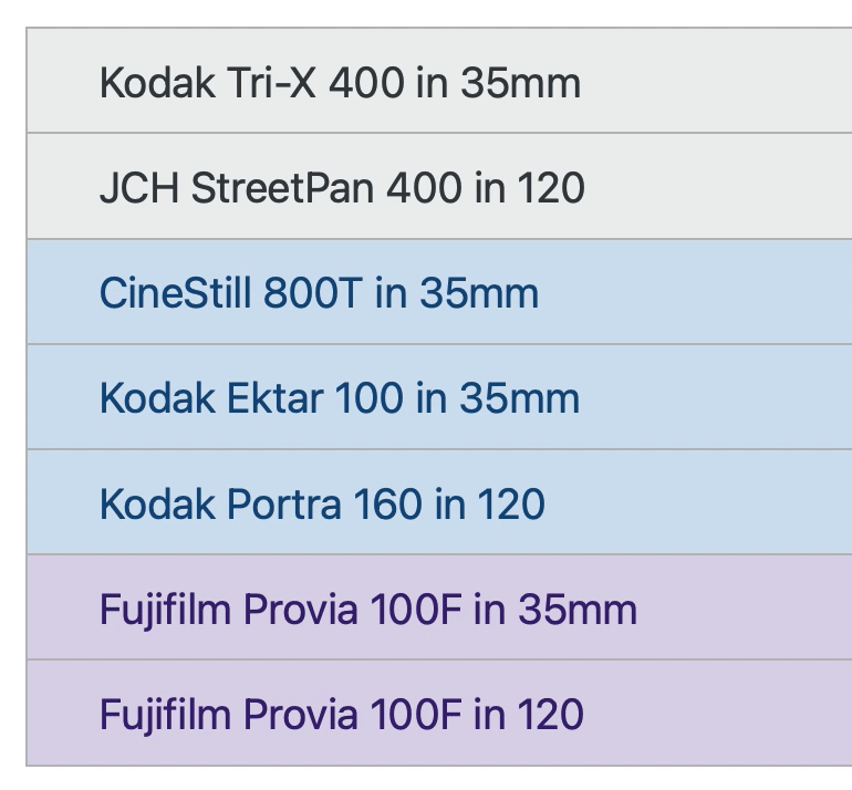
Here’s an example of hover styles for these new colors.
I hope folks like the new styles better than the old ones!
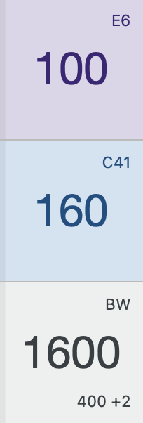
Project Detail Page Style Updates, Adding the Ability to Use Multiple Camera Backs in a Project
Based on some of the style updates previously mentioned, the project detail page has gotten some much-needed attention. And you can now work with cameras that have multiple backs in the context of a project. I’m surprised nobody ran into trouble with that before! 😅
Before:
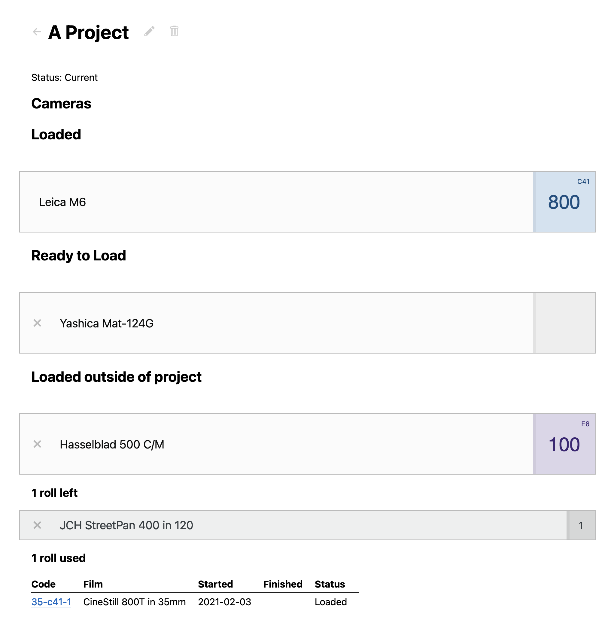
After: